As naturally visual creatures, sight is central to our every day. Social interactions, entertainment, and many other activities rely on visual cues to progress and be more immersive.
In eCommerce, aesthetic appeal plays a crucial role in establishing consumer relationships. Leads form first impressions within 50 milliseconds of landing on your website, using colors, fonts, graphics, and layout to judge your brand.
When visitors don’t feel compelled by your web page design, they are likely to bounce and turn to your competitors. This is why web design is so important.
Attractive websites keep customers engaged and encourage them to learn more about your products or services.
Of course, there is more to web design than appearances. The art aims to facilitate meaningful interactions so it also caters to functionality, usability, and responsiveness.
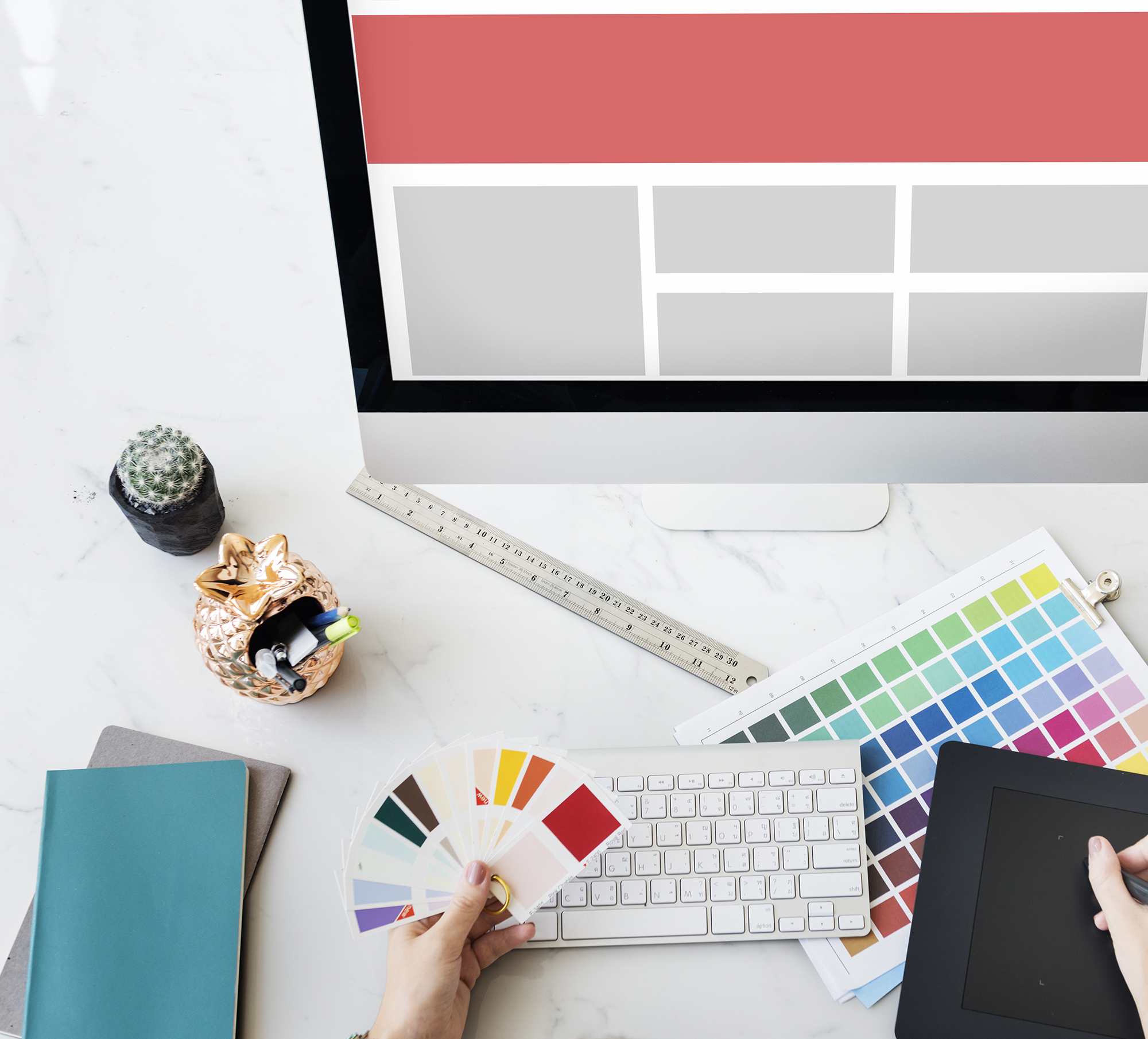
While going through your style guide, keep in mind that every decision needs to be attuned to your brand. Keep your branding book handy and consider the nature of your company and target audience.
Choosing the Right Colors for Web Design
Colors are powerful tools of communication. They express unique meanings and evoke emotional responses from customers.
Applying color psychology reinforces your message and brand identity. It also helps nudge your visitors to act on CTAs positively.
Take note, however, that meanings associated with colors vary from culture to culture. Below are how common colors are perceived in the United States:
- Red – signifies passion, boldness, and intensity. The color elicits a sense of urgency or excitement, encouraging users to interact with design elements. It is suitable for food, fashion, and sports, but not for luxury goods and professional websites.
- Orange – communicates warmth and excitement. Orange is less aggressive than red but the color is still hard to miss. It is associated with fun and friendliness so it’s good for childcare, entertainment, and eCommerce.
- Yellow – the color of youth, joy, and clarity. Yellow energizes viewers and provides a calm and happy atmosphere. It can be used to draw attention to CTA text and buttons, but use it sparingly as it can be straining to look at.
- Blue – projects trustworthiness and professionalism. It’s a popular choice in fields like medicine, law, public service, and technology. Use this color carefully as certain shades make brands appear cold and uncaring.
- Green – conveys growth, trust, and healing. Green is the perfect color for natural and organic products, environmental websites, and finance. This color is less appropriate for luxury items and technology.
- Black – implies elegance, luxury, and power. Black is a versatile color that comes off as traditional, modern, or edgy depending on how it’s used. It is great for fashion, marketing, cosmetics, and luxury goods.
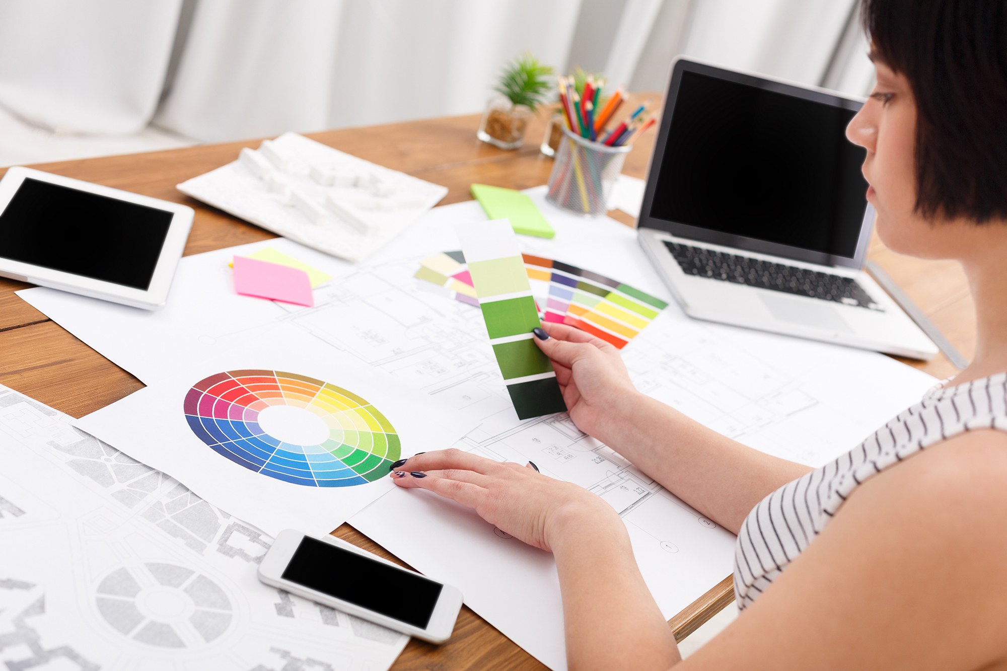
Defining Your Color Palette
It helps to have an understanding of color theory when defining your palette. To come up with combinations fast, refer to the color wheel and apply the principles of analogous, complementary, monochromatic, or triad color harmonies.
From the position of colors on the wheel, you can form an analogous color palette by selecting any three colors which appear side by side. For example, blue-green, green, and yellow-green.
In contrast, complementary color harmonies are made up of any two colors directly opposite each other like blue-green and red-orange.
Triad color harmonies are identified by choosing three colors that form a triangle inside the wheel. One combination is yellow-orange, red-violet, and blue-green. Finally, a monochromatic color scheme is composed of only one color in different shades.
There are only 12 colors in a standard color wheel but you aren’t limited to that selection. Millions of colors are at your disposal, each one described using color models. For web design, we use RGB and hex codes. These models define colors by quantifying three of four values or color components.
With an expansive set of options, there’s plenty of room to get creative, but it’s also easy to feel overwhelmed. Thankfully, there are tools like Colourcode and Adobe Color CC to generate color palettes for you based on your input.
Generally, you’d want one to three main colors that will be used for the majority of your visuals. These should be balanced with one contrasting color (or pop color) to highlight important information and one to two neutral colors for empty spaces.
You can take inspiration from popular websites, or better yet, work with a seasoned web designer for a professional touch.
Setting Typography Rules
Typography refers to the art of arranging letters and text. Its goal is to make copies clear, legible, and eye-catching. Similar to colors, typography styles have the power to elicit certain emotions and convey implicit messages at a glance.
It may seem trivial, but typographical elements like typefaces, spacing, and alignment have profound effects on how users digest information. These influence how persuasive and credible your copies are perceived and enhance your website’s personality to build brand recognition.
Choose a maximum of three different fonts and designate which ones will be used for headings, running text, forms, and alert messages.
Fonts should be highly legible, so stick to minimalist styles. This will keep the user interface neat and streamlined. If you wish to include script or decorative fonts, do so infrequently. Readability is always of higher priority over visual appeal.
Complete your typography hierarchy by setting font sizes to different text types. It is ideal to follow a logical progression of sizes and avoid intermediate ones.
You should also aim to achieve vertical rhythm between elements. That is, you have to keep vertical spaces uniform.
Do this by using the line-height property of your body text as a baseline. If that value is set to 24px, for example, set the vertical space between elements and the line-height of all text to a multiple of 24px.
The resulting layout will look more orderly and professional, plus copies will be easier to read.
Adding Graphics to Your Web Design
Website designs are supposed to be visually engaging. A great way to pull this off is by adding graphics such as media, icons, and illustrations. Inserting high-quality images boosts conversion rates as they bring your products or services closer to consumers.
Unfortunately, there are drawbacks to having too many graphics on your website. The same photos and videos that delight users may also be the reason for high bounce rates. Graphics blow up page sizes, harming your site speed and causing visitors to take the exit.
Address this by thoughtfully deciding on which ones to include and leave out. Make it a point to add graphics only when they provide genuine value such as on product pages.
You can improve loading time by saving graphics specifically for web use or compressing images through platforms like TinyPNG. Also, take note of the format in which you save your graphics. See if you can reduce file sizes by switching between JPG or PNG. If you’re using vectors, always save them as SVG to keep them lightweight while preserving sharpness.
For videos, opt to embed the link from another platform to minimize speed interference.
Another important reminder is to set specifications for your graphics early on. Determine what dimensions, opacity, color scheme, and filters should be applied to your photos, especially when you’re outsourcing website management after launch.
Do the same for videos, icons, and custom illustrations. For the latter two, you’d also want to specify the style you’re going for. Are the graphics going to be colored or monochromatic? Filled or outlines?
Defining these rules will make everything cohesive and grant your website a singular voice to establish your brand.
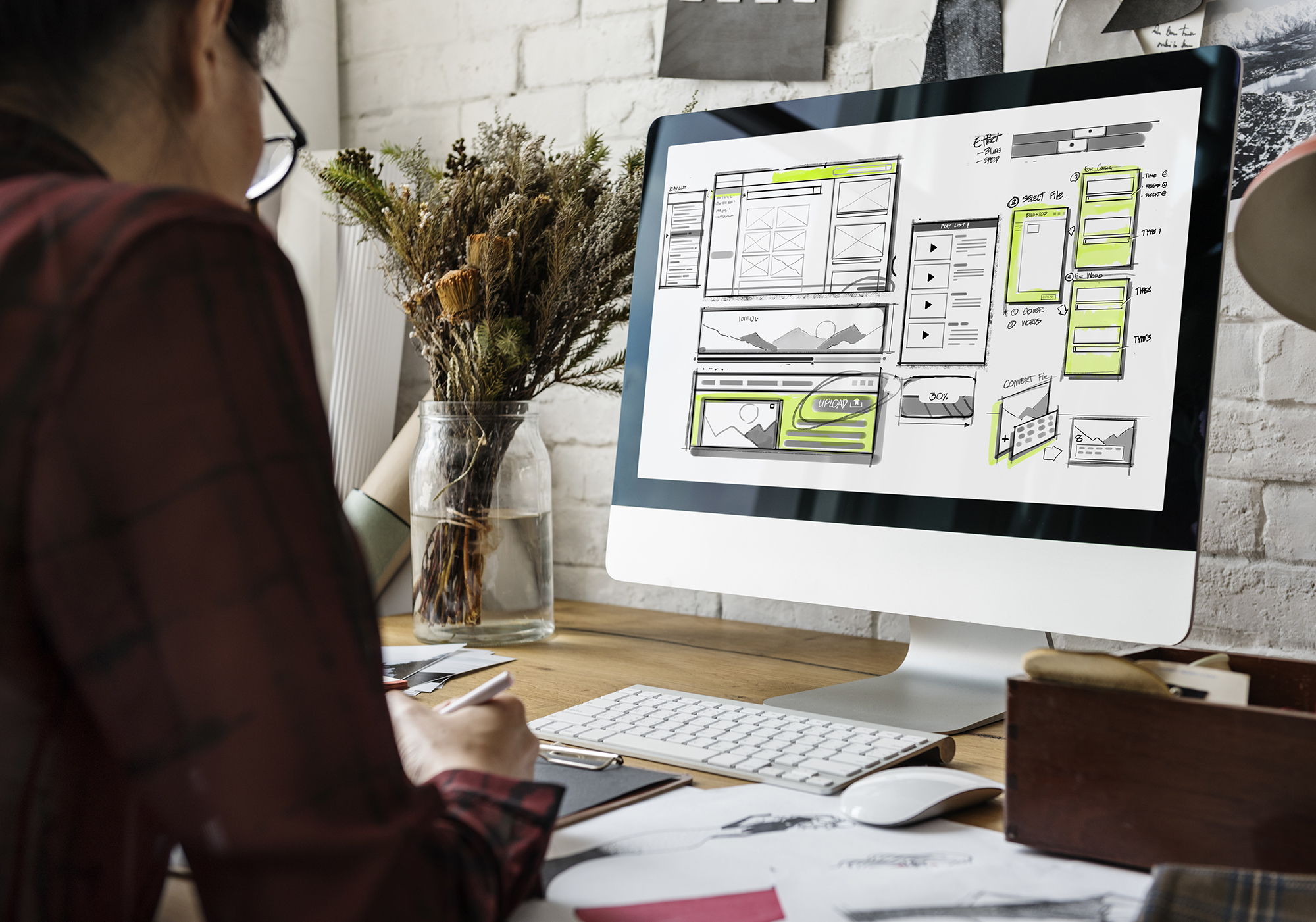
Creating a User-Centric Layout
Again, web design isn’t just about making pages look good. Users come to websites to accomplish tasks, and it is your job to help them do these with ease. This means catering to their preferences and providing an intuitive layout.
The most basic piece of advice is to use a layout grid. It divides a page into regions to help you see how elements jive in terms of size and position. As you slowly insert text, images, and more, remember to keep things straightforward and clutter-free.
For a truly user-centric design, invest in optimizing the following:
Visual Hierarchy
A lot of visitors are impatient and want the information they need to be presented to them right away. Applying visual hierarchy meets this demand by arranging elements in order of importance.
Position pertinent content on top followed by a compelling CTA. Play around with size, texture, and colors to direct your customers’ attention toward these elements.
It’s good to create contrast so that their eyes are naturally drawn to where you want them to be. Just be careful not to go overboard and ensure that your design is still balanced and coherent.
Navigation
When a visitor lands on your website, he or she should be able to navigate through your pages effortlessly.
Structure your site in a way that would help users to move from point A to point B on instinct. As much as you’d want to go for novelty, this is where embracing traditional layouts is more strategic. Place navigation menus where you’d expect them to be and keep options simple.
Users should be able to predict where to go next and how. Adding breadcrumbs is one way to help users keep track of their movements, but don’t rely on them too much. Instead, focus on streamlining your primary navigation tools. Make use of search bars and indicate clearly where links redirect visitors to.
Accessibility and Responsiveness
Online users have different means of viewing your website. Some prefer to surf the web on their computers while others turn to mobile phones or tablets.
But regardless of what device they’re on, consumers are known to leave websites when they fail to load quickly and properly after three seconds.
Optimize your website design for all devices even if it means your pages won’t look identical on each one. Resize buttons for mobile pages to make them more clickable and leverage AMPs (accelerated mobile pages) to display content fast.
Finally, consider how to improve user experience for people with disabilities. Allow users to tap into website functionalities through different ways and revise copies and alerts so that they are easily understood.
At the end of the day, you are designing not just to showcase your brand, but also to fulfill your customers’ needs. Think of them while you’re drafting your web design and constantly test and adapt to their dynamic surfing behaviors.
Want to see your vision come to life? Outsource your web development project to work with a team of professional web developers and designers. Get in touch with DevWerkz today.