Digital design has a lot to do with the success of marketing campaigns, websites, and ads. With screentime at an all-time high, its importance is more pronounced now than it has been for the past 20 years.
Apart from making things look beautiful, digital design has the power to evoke specific emotions and communicate subliminal messages. It’s a craft that requires artistry and a good understanding of human behavior.
Of course, it takes time to develop an eye for design and all of the instincts that come with it. There are an infinite number of possibilities and it can feel overwhelming. But knowing the basics and best practices used by professionals puts you on the right path.
Whether it’s for a web page, social media ad, or email marketing campaign, we recommend following these tips to impress your target audience.
1. Perfect your color theory
Color makes designs striking and memorable. It sets the tone of your finished product and influences how consumers perceive a brand.
Certain colors are associated with elegance and sophistication, while others are used to appear youthful and casual. The psychology of color is part of perfecting your color theory, which is a long road of trial and error.
Start by familiarizing yourself with basic colors and then move your way up to the color wheel. The layout of the color wheel is arranged such that primary colors are equidistant from each other with secondary and tertiary colors placed between them.

You can use the color wheel to create your color palette either by choosing complementary, analogous, or triad colors. Keep in mind that the color combination must reflect the image you want for your brand.
Finally, include neutral colors for your background and add one that stands out from the rest of your palette for links and buttons.
2. Consider colorblindness
According to a report in 2021, 1 in 12 men and 1 in 200 women are colorblind. Colorblindness makes it difficult for users to differentiate between two colors, commonly green and orange or red and green. That said, you can imagine how this condition affects user experience.
Someone with colorblindness won’t be able to pick up on certain instructions and visual cues that rely on color as a guide. For example, if your password field turns red when it doesn’t match the username, someone with colorblindness would take longer to figure out what’s going on.
One way to improve accessibility for these users is to add labels that support the message conveyed by colors. In our previous example, you can add “Incorrect password” below the field to help users proceed.
Additionally, avoid putting two colors close together if they’re affected by the most common forms of color blindness. Aside from the combinations we mentioned earlier, try not to pair up blue and purple, red and brown, and blue and green on your design.
3. Choose fonts wisely
Typography refers to the style, size, and spacing of text. The point of which is to make words legible and add character to your copy. It can also be used to establish content hierarchy and aid in navigation.
Pairing contrasting font styles and adjusting font size and width show the different levels of content. But don’t go overboard and choose styles that are too different from each other. Remember that they still need to look coherent. Ideally, they should share some features like similar proportions or x-height.
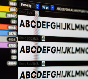
Serif and sans-serif typefaces are typically used for their readability. Serif fonts are especially useful for smaller sections of your design, while sans-serif fonts are used for titles and headlines.
Display and script fonts make up the other half of basic typefaces. The former is characterized by bold, eye-catching fonts, while the latter mimics hand lettering. Both categories aren’t recommended for long body text as they’re hard to read, but they’re great for decorative purposes.
Note that low-resolution devices fail to display serif fonts properly. Plus, not all serif and sans-serif fonts are made equal. Depending on the font style they can have varying levels of legibility.
4. Break up heavy text
Heavy blocks of text are an eyesore. Even with the correct use of typography, users are likely to feel fatigued just by looking at congested sections of your design. In the worst-case scenario, they wouldn’t bother reading your copy and forget about our brand altogether.
Breaking up paragraphs gives users room to breathe and digest what they’ve just read. The most common way to do this is through graphics. Photos, illustrations, and diagrams enhance user experience and convey information succinctly.
You can also use pull quotes to highlight important lines in your copy while providing a visual break for your readers.
If that’s not your style, you can go with headers. And since the majority of consumers scan through text quickly, it’s an advantage to summarize key points they read on the go.
5. Source images responsibly
It’s tempting to grab a photo off the internet and use it for your designs. But a lot of the things you find online are copyrighted and should not be taken without permission.
If you must use photos from the internet, make sure to get them from stock photo sites. There are paid and free sites available with thousands of images for your perusal. Unsplash, Pexels, and Pixabay are among the top free sites where you can get quality images.

For a coherent feel, we recommend looking up photos by photographer. Usually, they’ll have similar entries with the same theme and lighting on their portfolio, making it easier for you to match images.
Capturing photos yourself is highly recommended but sometimes you’re left with no other choice but to use stock images. It’s all good and well so long as you source them responsibly. To up their allure, you can touch up the photo as needed and add your own illustrations.
6. Use a grid
As a beginner, you’re probably wondering how professionals organize elements in their design. The answer is simple: grids.
When we publish our ads and other graphics, everything appears to be floating and interacting with each other naturally. But during the design process, we use grids to ensure that the final product is balanced and easy to understand.
Every shape and line is placed deliberately while taking into account UX. Without grids, designs look cluttered and it’s harder to spot inconsistencies in size and spacing.
You can take liberties when using grids and veer away from the guidelines to make an impact. Some designers purposely break grids when placing headlines for an eye-catching effect. But we recommend attempting such design choices only when you’re comfortable enough with the basics.
7. Leave white space
Finally, we’re down to white space. It seems counterintuitive that “untouched” sections of a design are crucial to making it work. But white space is just that—unmarked spaces that let the layout breathe and look better.
We want to clarify that white space doesn’t necessarily mean an empty block of white. It could be the color of your background and have texture, as long as it separates the different elements of your design.

The use of white space is soothing because it prevents users from being overloaded with visual stimulation. That’s why it’s a must to have white space in between lines of text to improve readability.
Additionally, it points consumers to where their attention should be and encourages them to interact with your brand. With it, you have the opportunity to highlight certain graphics and CTA buttons to boost conversion.
Work with a Professional Team of Digital Designers
Thinking about your next email marketing campaign or social media ad? Let us design your email templates and advertisements to get the most out of their run. Contact DevWerkz today.