The field of web design is miles away from where it started. It’s graduated from static HTML pages to highly personalized and responsive interfaces for all kinds of users.
With every bit of technological advancement, web developers and designers get better tools to make memorable online experiences. Touch gestures, chatbots, and voice-controlled web pages are prime examples of recent breakthroughs.
Visually, retro designs are finding their way back into the limelight. Many designers are moving away from photograph-heavy layouts and are exploring creative opportunities using typography, grids, and lines.
In this blog, we’re giving you a headstart to prepare for what’s to come next year. Here are 7 web design trends that will define the world wide web in 2022.
1. Typographic Hero Images
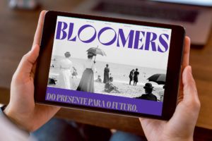
Typography-led hero images are becoming the norm for many websites. Some designers completely leave out imagery to let the text speak for itself, while others incorporate simple photos or illustrations.
The beauty of this design is that it’s bold and it commands the attention of users. You need a font style that’s legible against a background that will make the text pop.
Solid color backgrounds are best at giving that nice contrast, but high-quality photo works too with proper text placement.
2. Collage Illustration
Collage-style graphics allow you to experiment with different shapes, patterns, and images to give a unique, approachable feel to your website.
This style gets a bad reputation for being too crowded or incohesive, but professional web designers know exactly how to use this to their advantage.
Collage illustrations break up the monotony by embracing off-axis layouts and asymmetry. Plus, with the right use of white space, the design can still look breathable and won’t appear overwhelming.
The trick is to have an element that ties everything together. It could be your color palette, a photo filter, or a subtle tint. Have a game plan or a story to tell so your work doesn’t get sloppy.
3. Glassmorphism
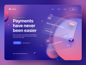
Glassmorphism exploration – Online Banking Website by Bogusław Podhalicz
Glassmorphism is a trend that makes elements on a page look like frosted glass. Its wow factor is magnified when combined with subtle movements to produce a 3D effect.
Glassmorphism is achieved by manipulating transparency, blur, and shadows. Blurring the background adds depth and creates the illusion of a floating object. Adding a light border takes it a step further as it simulates a glass edge, making it stand out.
When using this technique, pick vivid colors for your background otherwise, the effect won’t be as clear.
You can apply glassmorphism in logos, banners, or full sections of a web page. Just be careful not to go overboard as some parts of your text may lose readability and affect user experience.
4. Micro Animations
Microanimations are small animations that play automatically or when triggered by user interaction. They elevate visual appeal and could serve as visual cues to help users navigate your website.
Micro animations on hero images add flair, while micro interactions on icons show attention to detail and aid in web accessibility.
Some eCommerce websites use micro animations on their product pages to display items from different angles. With it, clothing stores can demonstrate how a garment hugs the body while the wearer is in motion.
You want your micro animations to flow smoothly and at the right speed. Make it too fast and it may be more irritating than appealing; make it too complex and it might take a toll on your site speed. Keep things simple and remember who you’re designing your pages for.
5. Visible Borders
There is nothing more satisfying than removing grids after finishing a wireframe. However, in 2022, leaving visible borders is a point in your favor.
Visible borders are the perfect touch to complete a retro vibe, but more importantly, they make web content easier to consume. Clear demarcations help users focus on one section at a time, removing the guesswork of where to go next.
The most important detail for this design choice is line weight. Fine lines exude a sharp minimalist feel, while chunkier lines emanate a playful atmosphere.
Both thin- and thick-lined borders go well with a muted color palette and solid typefaces. Because this trend frames text and graphics, triple-check your web copy and visual elements before publishing as flaws would stick out like a sore thumb.
6. Memphis Design
Memphis design was one of the predominant styles in the ’80s. The movement was all about bright shapes and lines as well as out-of-the-box patterns that go against minimalism.
Looking at typical websites today, it makes sense for Memphis designs to re-emerge. Although minimalistic interfaces are intuitive, they do little for branding as things start to look too uniform.
Breaking away from predictability allows websites to have their own personality and makes them appear welcoming. The components of Memphis designs are bold and adventurous, which make for unforgettable online experiences.
If you’re afraid to go all out on neon colors and geometric shapes, start with thick strokes and squiggly lines. What’s important is for your design to evoke cheery emotions while setting you apart from standard layouts.
7. Animated Scrolling
Another way to catch people’s attention is to incorporate scroll-triggered animations. The most common scrolling animations are designed to move when an object is seen within the viewport. Page elements can either vibrate, change color, slide, and so on.
Parallax scroll animations are more advanced. As a user scrolls down, foreground and background elements move at different rates and/or directions. The result is an illusion of depth that effectively immerses visitors as they make their way down to the bottom of the page.
Well-design scrolling effects have the ability to nudge users to convert. Apart from delivering a visually attractive environment, they encourage active participation and highlight important sections on your site.
Before diving into your design, craft a storyboard to ensure the finished product will be cohesive. You’ll need a great deal of technical skill to pull this off since timing and synchronization are a must, but if you do, the results are well worth the effort.
Revamp Your Website with DevWerkz
Want to give your website a new look? Our professional team of web developers and designers can do that and more. Contact DevWerkz today.